Thursday, October 14th, 2021

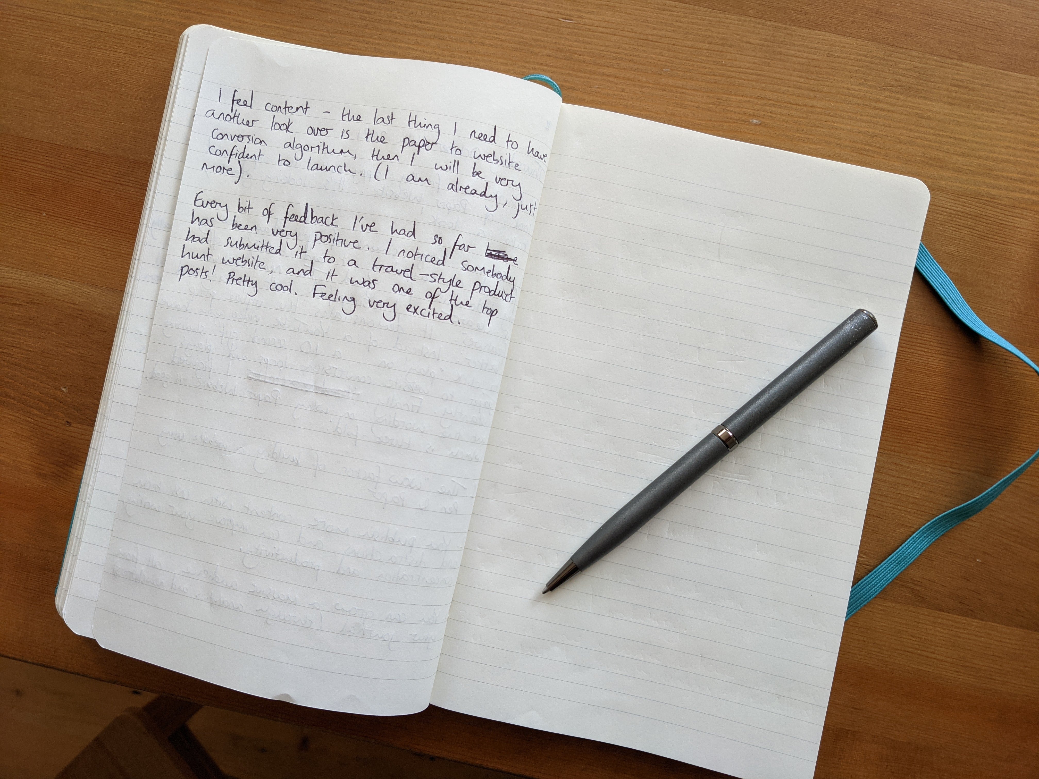
I think I'm finally happy with the copy and look of Paper Website. It's looking great, take a look! https://paperwebsite.com
I spent a large chunk of yesterday solely focused on completing it and ticking it off my to-do list for good.
The new website is clearer: I simplified text, pricing and features.
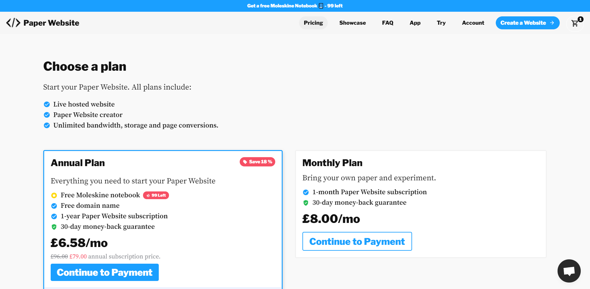
It demonstrates the value proposition better. Instead of having a YouTube video you have to click play on that explains Paper Website, I've changed it for a 10 second gif showing the paper to website conversion that loops and plays instantly.
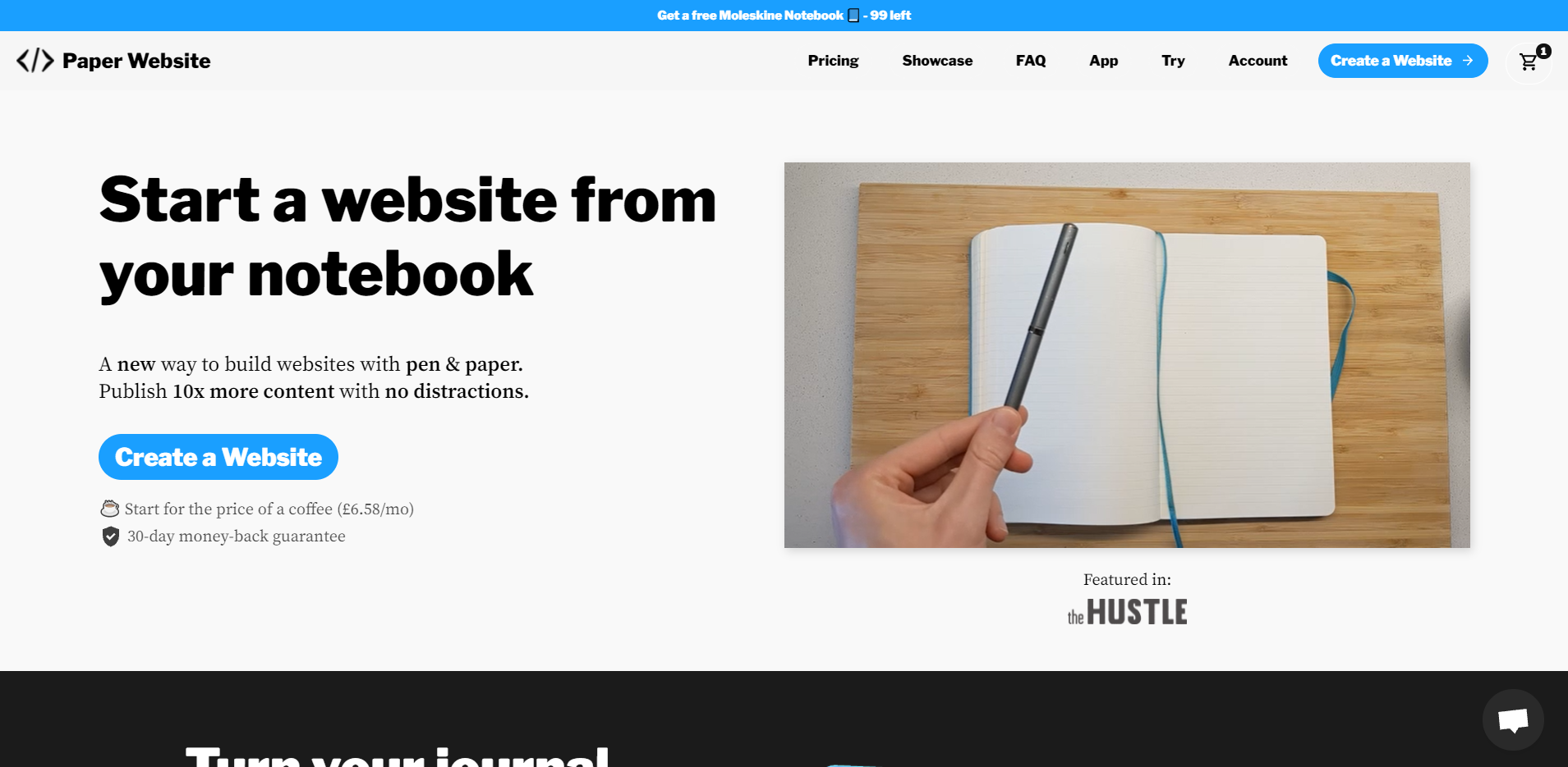
Finally I figured out the three main reasons why Paper Website is good:
1. The "wow factor" of building a website using pen and paper.
2. You publish more content with less tech and distractions, and can improve your writing, concentration, and productivity.
3. You can grow a massive audience, all from your journal (through analytics and newsletters).
These were benefits I knew, but couldn't quite put into the right words.
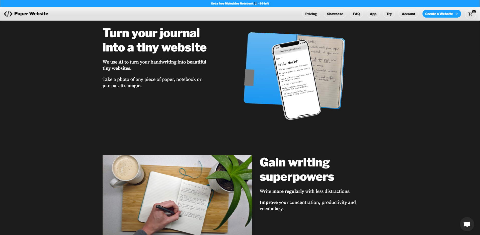
I feel content - the last thing I need to have another look over is the paper to website conversion algorithm, then I will be very confident to launch. (I am already, just more.)
Every bit of feedback I've had so far has been very positive. I noticed somebody had submitted it, to a travel-style product hunt website, and it was one of the top posts! Pretty cool. Feeling very excited.
